ShowBizPizza.com Version 3.0 -
"ShowBizPizza.com"
(January 2006 - Current)
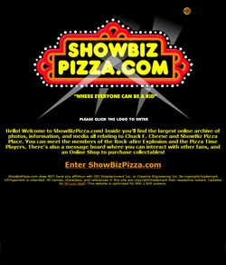 Intro Page |
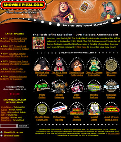 Homepage |
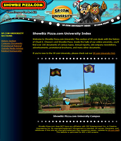 Section Index |
Remember how in the last page I mentioned how I resist change? I still stand by that comment, but you'll notice that "SP.com Version 3.0" bares little resemblance to its former self. This was pretty much a top to bottom remodel, and quite the undertaking (and it's technically still not finished). Boy I can remember when I was putting this together how nervous I was to debut it - I ran sample designs by my ex-wife constantly for approval - which were met by comments like "Are you sure you want to do this?". Links to the demo were also sent out to a few close friends including ShineyHappyJenn and some former staff members for their thoughts before I took it public.
Personally I felt this remodel was something that had to be done. The old thrown-together HTML of the former designs had some charm, but SP.com was now the only fansite online dedicated to this unique subject and it really deserved to have a more professional appearance. So I started browsing templates online and found the perfect one. The only problem was that they wanted money for it - $50, $500, I can't even remember - whatever it was ended up being more than my cheapskate self was willing for fork over. So I figured screw it, I know enough HTML to put pages together, and I knew my way around Photoshop, so once again I stole the design and modified it to suit my needs. Before I found this template, I knew I wanted a dimentional strand of chaser-lights and this one had the foundation that was perfect.
My original plan had been to incorporate Flash into the site and truly bring it up to par with modern internet standards (such as the intro splash put together by Brian which still gives me chills). But after a brief experiment with Flash, I decided me is not smart enough for Flash. Really all I wanted to do was steal the effect used on the Muppet Central banners for my index icons. So using some old school tricks I did just that while avoiding Flash altogether.
Along the organizational lines, the goal was to segment SP.com into its own webring of sections, each one differentiated with a unique color scheme and section logo - yet all tied together by the SP.com logo, template design, and navigational pattern. The end result was a branding effort that gave each sub-section a unique identity and the new template gave a nice shell in which to display section logos. Long story short the concept of the re-design was "everything matching and everything unique".
Lastly, the remodel was designed to put the emphasis on the website itself over myself & the rest of the SP.com staff (which literally became a footnote at the bottom of each page). The tag "Where Everyone Can Be A Kid" was also adopted as a play on CEC's slogan, as I felt it was better suited to our diverse community containing kids of all ages and walks of life. This slogan was first debuted in 2005 on the CV2 Limited Edition CEC plush (more on that in the promotional wing of the tour).
Interesting tidbits: Technically there was a "Version 3.5" remodel that occured a few years back, but since it mostly affected the embedded code and not the website design, it won't be considered a new section. The change was a conversion from solid HTML to CSS coding. The reason? By chaining every page of the site (literally hundreds of pages currently) to a handful of CSS style-pages, the entire appearance of the website can be changed by the alteration of a few scripts. Right now this is slated to only affect seasonal / holiday / special occasions such as the changeover for the 10th Anniversary. Ultimately though, if the day comes for a "Version 4.0" remodel, it can be controlled in the same fashion thus saving me from wanting to choke myself with my mouse cord. Ha ha, kidding again... my mouse is cordless.
